Font Choices and Justifications
When making a horror opening title sequence, it is important to ensure the font of the title matches the theme we are portraying, which is slasher. Therefore we need to create a font that is not too plain. It needs to be eye-catching and immediately suggest slasher.

The first font is very simple but effective. The font has a mysterious edge to it that suggests a tense and dangerous atmosphere. Keeping it basic may be a good idea to get the audience immediately engaged, however it is not the most bold and exciting choice of font, which may make it less interesting to look at compared to other slasher films. As our film is a slasher, the font needs to be associated more with blood and guts to make it appeal to our audience. However, having said this, despite it being slightly plain and neat, it does look classy and professional, which is what we want our horror film to look like. We don't want the font to be cheesy or not look modern enough. Therefore, this font is a strong contender for our final title choice due to its simple but very effective look.

The second font suggests an awkward, disturbing and backwards connotation. It is associated with horror which makes it suitable, but the font seems a little too thin to suggest anything majorly scary or slasher-genre, therefore, we have no chosen this font to be our final title. For our final font, it needs to be bolder and thicker to make it look scarier and suggest danger. The audience to infer what type of horror it will be from the font of the title. This title doesn't suggest anything extremely frightening, just mysterious and slightly eerie.

Our third and final font is a bold and scary font. It suggests uneasiness and slasher because it is edgy and has scratch marks all over it. It is different to our other practice fonts and much more eye-catching, pushing us to possibly decide on this font for our actual title. It suits the sub-genre of slasher and can suggest a variety of murders and deaths. In our opening title sequence, we may make the colour of the title red to apply to the sub-genre of slasher, implying blood and murder. We feel this may be the most suited font choice as it stands out the most compared to other two, and immediately suggests and represents fright, monstrosity, panic, blood and death. However, on the other hand, this font may come across as slightly amateurish and cheesy. It doesn't look as professional as the other fonts we have practiced with, which may undermine its possibility of being our final choice.
In conclusion, considering both professionalism and the sub-genre of our horror, we have decided to go with the first font choice. This is because it suggests horror and something slightly mysterious, and most importantly, looks classy and professional. The third font is not as professional-looking and looks more like older horror film titles. We want our OTS to be modern and unique, which is why we have chosen to go with the first font.
To create our font for our title, we used inspiration and research of other horror film title choices. We looked at Woman In Black and Insidious in particular. This was due to their fonts that stood out and applied to their sub-genre. The colours they used also contributed to helping us construct our final title. By having our title in red, it suggests blood and death and immediately relates to horror, but also manages to keep the font looking classy and professional.
To create our font for our title, we used inspiration and research of other horror film title choices. We looked at Woman In Black and Insidious in particular. This was due to their fonts that stood out and applied to their sub-genre. The colours they used also contributed to helping us construct our final title. By having our title in red, it suggests blood and death and immediately relates to horror, but also manages to keep the font looking classy and professional.

The scratchy, chalkboard-style and fading text in the Woman In Black makes the audience panicky and uncomfortable. The white colour typically suggests purity and innocence, however in the case of horror, it suggests something completely different and makes the audience anxious and uneasy. This contributed to our decision to make the text red, as like the Woman In Black, it contributes to the sub-genre of our film; the colour red represents blood and death in a slasher movie. We also liked this font as its not over the top; it has a simple and professional look to it which makes it eye-catching and entices its audience in.
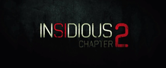
We were also inspired by the Insidious title choice as it contained white and red colours, again suggesting danger and death. The font is quite simple and basic, but it is effective as it immediately grabs the attention of the audience and draws them in to the scary and mysterious atmosphere it creates. For our title, we wanted to do something similar, where there is not too much going on and it doesn't look unprofessional. We want it to be fairly simple, but eye-catching and create a sense of fear and danger, which is exactly what this title does.
To further help us choose which font to use for our OTS, we put our choices on social media and asked for other people's opinions on them. The screenshots below show that the first font was the most popular, which was what we decided to go with in the end anyway. People liked how it was simple but effective. It was the easiest to read, making it the most interesting and exciting. The fact that the majority liked it the most gives us confidence that it was the best decision to go with and it will be the best suited for our OTS. There were also a couple of comments about how the third font applied to the themes of slasher; especially because of the bold and scratchy text. They liked how it was eye-catching and scary-looking. Although some people liked the third choice, more people liked the first font, as did we, down to how it comes across to the audience on first impressions; professional and suitable. It was very helpful to ask other people for their views and opinions as it gave us an insight to how other people see horror and what they think works and doesn't work, helping us to come to a concluding decision.

